Tag: post3

Module 3: Universal Design for Learning Framework

This module taught us about accessibility, diversity, privacy, and ethics in learning and learning environments. Throughout my blog post today, I would like to discuss how the Universal Design for Learning (UDL) framework applies to a topic I have previously taught to students. 

In one of my past university courses, I created a presentation for an assignment, and my professor asked me to come to teach it in their middle year’s classroom. I will discuss this presentation and the parts of it which reflect the UDL framework for learning.

Here is a copy of my PowerPoint presentations to follow along.

I prepared a video walkthrough of my UDL PowerPoint incase you don’t feel like reading 🙂

The first thing that you will notice in this PowerPoint is that it is colourful and very blue. I have purposely chosen these colours as they are high in contrast, or not colours that are commonly associated with colour blindness, and are exciting to look at. Often times slideshow creators select colours that do not contrast with each other, are challenging to read, or do not consider colour blindness. Colour choice and contrast are essential in a UDL so that information is easy to access, read, and see (IDRC, n.d.). 

Next, you will notice that information is offered in more than one format. Students can read the text on each slide while they listen to the instructor present the information. There are also visuals and graphics to help enhance understanding. Further, there are engaging videos throughout the slideshow. Another noteworthy mention is that for each activity, there is a description of it that students can refer to while completing the activity. 
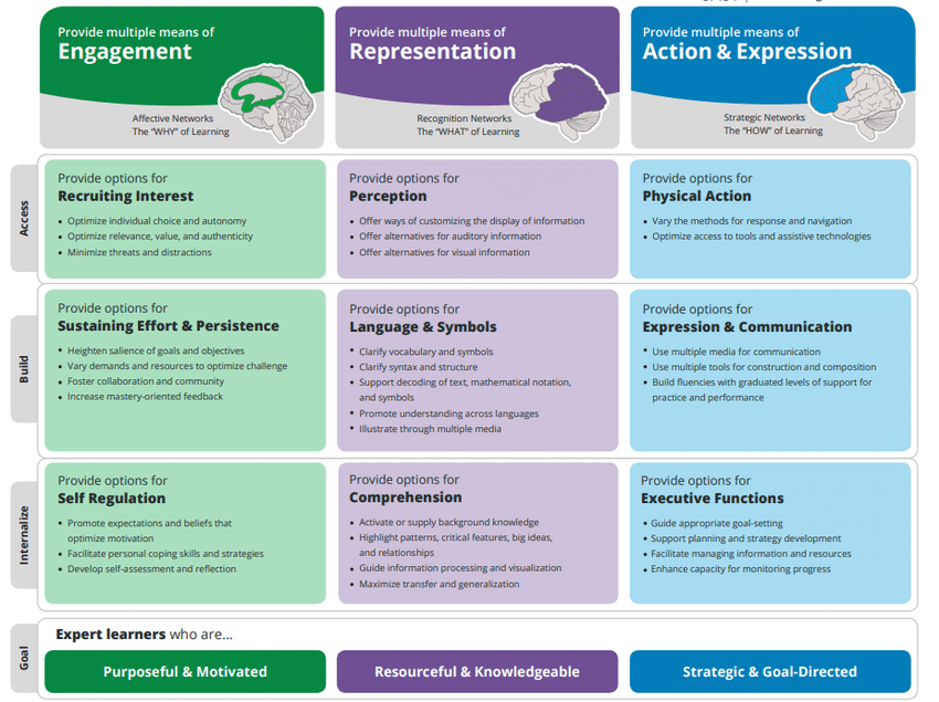
Click here for more on UDLs!

Overall, this slideshow supports a UDL as it presents the lesson’s goals, includes various teaching methods, incorporates various materials, and includes an assessment activity for each topic to ensure student understanding (CAST, 2018). Students must know the lesson’s goals to understand the important takeaways (CAST, 2018). Further, not every student learns the same, so presenting the information using various methods with various materials will help ensure every student can be included in the lesson and be successful (CAST, 2018). Lastly, assessment is essential, and students expect assessment (CAST, 2018). Each assessment activity is different and can be modified on the spot to be done individually, in groups, or as a class, depending on the needs of the students

I chose this learning portfolio prompt because I am passionate about inclusion in the learning environment, which is fostered when a teacher has prepared a UDL. Essentially, I learned that a UDL is when a lesson is optimized to ensure learning and success for all. Teachers can create a lesson that adheres to every individual’s needs in their classroom to avoid any challenges that can be faced when teaching the lesson and help everyone feel included and welcomed in a learning environment. 

Hope you enjoyed the read 🙂

Amelia

References

Inclusive Design Research Centre. (n.d). What is inclusive design? Inclusive Design Research Centre. https://idrc.ocadu.ca/about/philosophy/

“About UDL” from CAST (2018) http://udloncampus.cast.org/page/udl_about

Blog Post #3: Inclusive Design and Universal Design in Media and Multimedia Learning

This week’s topic is accessibility and equity. Accessibility and inclusion in learning environments are essential in media and multimedia design. As educators, we should continually seek out strategies for adding accessibility to our lessons so that inclusion is built into our media and multimedia learning design.

Inclusive design means that anyone can come together to learn, no matter their ability, beliefs, or ethnicity, can come together to learn. If an inclusive design were to be summed up into one word, it would be accessibility. Many principles and ideas we have explored in this course so far connect to inclusive design. For example, for a design to be inclusive, it must first be engaging, offer multiple presentations of materials, and must allow students to use their new knowledge—these are Universal Design for Learning guidelines (UDL) (Jungles & Patel, 2019). Continuing, for design to be inclusive, it must work to create effective and meaningful learning experiences that Merrill’s Principles of Instruction promote (Jungles & Patel, 2019). For example, Merrill suggests we must engage learners and their learning experience to reap the full benefits of the material (Merrill, 2002). Essentially, we must allow learners to engage with the content, create something based on the content, complete an assessment, or provide an opportunity for group work and discussion. Last but not least, for a design to be inclusive, It must be accessible to as many people as possible. For example, Mayer’s Multimedia Principle states that people learn better when information is presented in various ways, such as text, audio, visual, or physical (Mayer, 2014). Essentially, the more ways that material is presented, the more opportunities people have to learn (Mayer, 2014). For example, some people are not great at learning from pictures but may learn very well from completing a project.

Designs for learning should be made as designs for buildings are made—teachers are the engineers of education, just as engineers are the ones who build our buildings. Just as engineers must create safe structures, teachers must create learning designs and use learning approaches in media and multimedia learning in which students will be accepted and adhere to each of their needs.

To achieve inclusive design, we can explore and experiment with various tools, such as the Web Accessibility Evaluation tool (WAVE) and other tools, such as captions. The WAVE tool Is an evaluation tool to help authors, contact creators, and website designers create a more accessible environment for individuals with disabilities. For example, I used the WAVE tool on my last blog post, and here is some of the feedback: some of the colours were low in contrast, my video did not contain captions, and my sketchnote example would be difficult for someone to read as it includes fancy writing and would not work with text-to-speech tools. There are a host of other tools we can use to create a more inclusive design. For example, we can use captions on videos for those with hearing or processing impairments. Further, in text, we can utilize various fonts and effects, such as bold, italic, or underlined, to draw attention to important information. I love utilizing fonts and effects in my blog posts to draw attention to important information or notable quotes. Images can also be used in an inclusive design, as we can include an alt text describing the picture. I always provide an alt text describing the picture or video for all of the photos and videos I have in my blog posts. Providing an alt text helps those with reading impairments to use text-to-speech tools to ensure they have access to all the information they need to be successful. We must continuously work to recognize exclusion where it exists and work to correct this exclusion, which these tools help us accomplish. 

Here is a video explaining a little bit more about my quote on teachers as engineers.

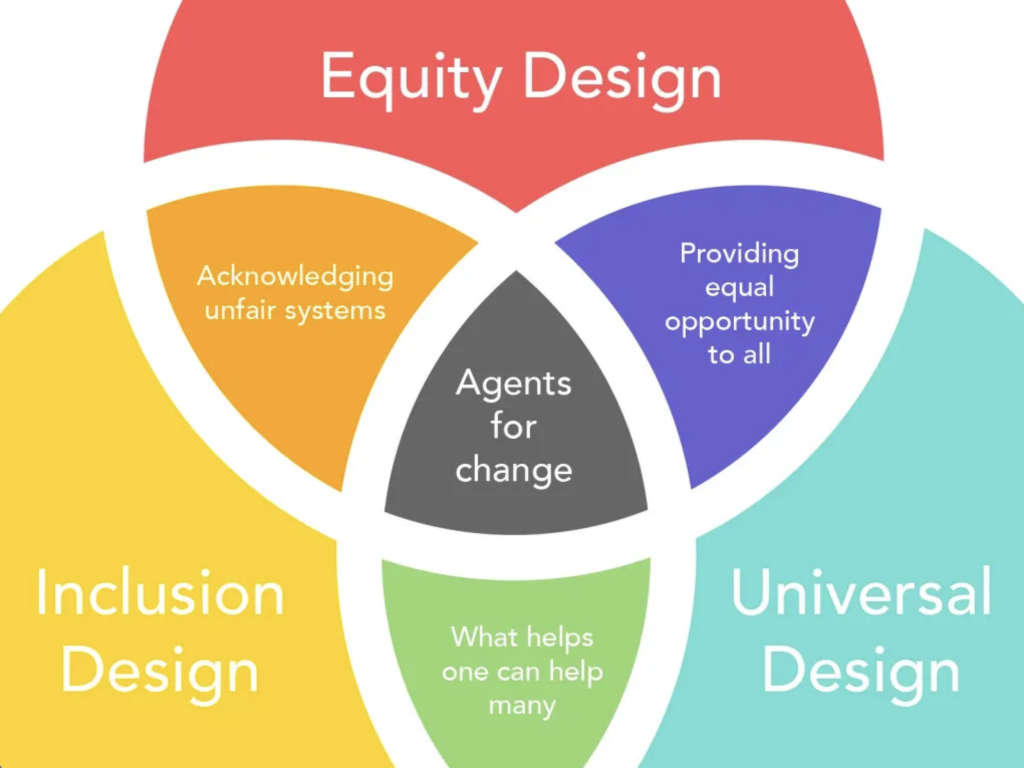
Inclusive design should not be mistaken for universal design. Inclusive design is “a methodology that enables and draws on the full range of human diversity. Most importantly, this means including and learning from people with a range of perspectives” (Vinney, 2021). In comparison, universal design is “the design of products and environments to be useable by all people, to the greatest extent possible, without the need for adaptation or specialized design” (Vinney, 2021).

Click here for more on the differences between inclusive design and universal design. Click here for the link to this image.

Creating media and multimedia to suit every individual’s needs is challenging. However, when designed with universal design guidelines, the result is a single solution that can accommodate as many people as possible (Jungles & Patel, 2019). For example, we can work to create an inclusive design for a few learning disabilities, such as those with hearing impairments, and these additions, such as captions, can be extended and helpful to many. Universal designs are curated based on diverse characteristics, such as ability, age, gender, race and ethnicity, to serve as an accessible resource to as many people as possible (Jungles & Patel, 2019). When we try our best to think of our target audience, work to address the needs of our population, and employ ideas and concepts of multimedia learning and UDL, we will be well on our way to creating an inclusive learning environment and design. 

I hope you all enjoyed 🙂

Amelia

References

Jungles, A., & Patel, C. (2019, June 24). What is universal design for learning?YouTube. Retrieved September 26, 2022, from https://www.youtube.com/watch?v=pdmoBl3Z75I 

Mayer, R. E. (Ed.). (2014). Principles for Reducing Extraneous Processing in Multimedia Learning, from The Cambridge Handbook of Multimedia Learning (2nd ed.). Cambridge University Press. pp 279 – 315

Merrill, M. D. (2002). First Principles of Instruction. ETR&D, 50, 3. pp. 43-59.

Vinney, C. (2021, August 5). Universal vs. Inclusive Design: What’s the difference? Career Foundry. Retrieved September 26, 2022, from https://careerfoundry.com/en/blog/ux-design/universal-vs-inclusive-design/ 

Inclusion and Social Media

Imagine you owned a small designing business or were a content creator making posts to spread happiness and laughter. To spread the word about your business and start developing your learning network (PLN), you would probably want to get on social media platforms with a public account to create content for the world to see. Depending on your taste and the overall image you want your business to exemplify, social media can play a role in helping you establish messaging and themes. With all of the negativity and hatred being spread online, many businesses and creators online have been using their platforms to create safe spaces that are inclusive and diverse for all to enjoy and spread light. Further, having a PLN that is public and engaging requires risk assessment and policy understanding, all of which we will dive into later. 

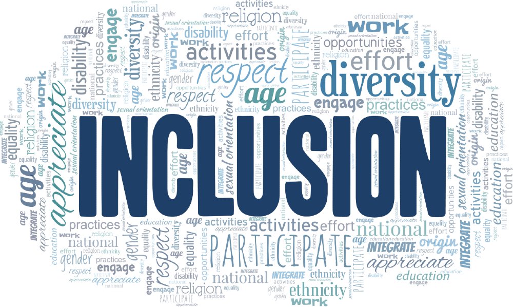
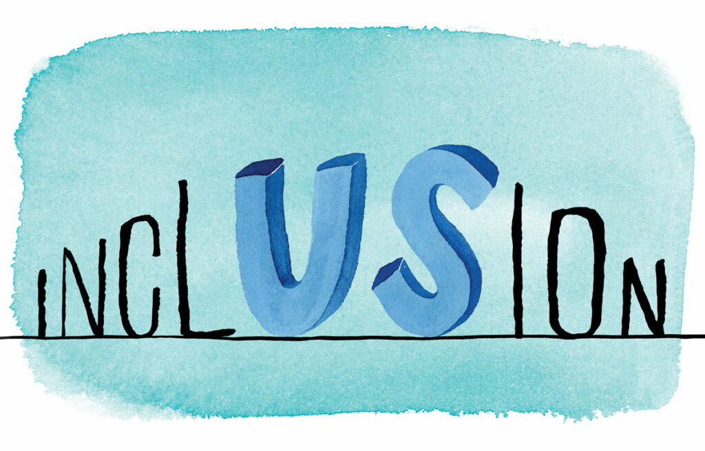
A fun word map on words people relate to inclusion.

Social media was made for users to engage in communication to build their PLNs. This communication may not always be personal and direct, but it can be through comments on a public post or even just viewing a post and liking it. Social media is widespread, and if you need to find something on social media, you can simply search it, and you will most likely find what you were looking for. However, this accessibility is both a blessing and a curse; social media can engage in communication or can pose challenges for communication. The accessibility of social media is a blessing because it can allow for some unique, inclusive, and diverse spaces for people to share their own experiences and raise awareness of injustices. On the other hand, it can also be a curse. Instead of working against injustices or creating inclusive and diverse spaces on the Internet, we can create places that are not diverse or inclusive and that make injustices instead of helping to solve them.

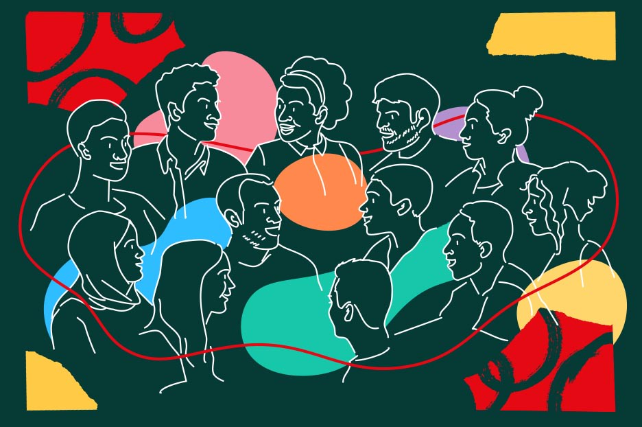
Click here for an article by Netflix on how they are working to become more inclusive.

Here is the million-dollar question: is social media inclusive? I believe there is no right or wrong answer to this question. Depending on the’ area’ of the Internet you are on, it could be inclusive, or it could not be inclusive (Arfini et al., 2019). I think of the Internet and social media as I think of different places in the world. You will see other things and have different experiences depending on where you want to go. To get to some niches (like the sketchy or illegal ones), you might have to cross some borders (do something to access these different places). There is a wide variety of what you can find online, and some areas are not inclusive. However, some amazingly constructed inclusive and diverse social media platforms are safe spaces for those to voice their opinions and share their stories. My final note here will be this: if you are looking for inclusivity, you will find it, and if you are looking for places with hatred, you will find those places too. Further, I believe who you associate with online, such as your PLN, reflects you and your values as a human being. Make it count. 

In my last blog post, which you can find here, I discussed employers with employees who questionably use their social platforms. For example, many employees lost their jobs or have taken hits to their reputations because they post and share discriminatory language. Further, some companies with employees who share derogatory words have suffered economic losses. For reasons like these, companies often have employee social media communication expectations policies. 

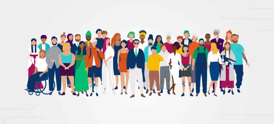
Here is more information on inclusion in the workplace.

Talking about inclusivity and PLNs, I feel it is essential to bring it home and talk about how I work to make my PLN and social media platforms inclusive. I have about 900 followers on Instagram, and I do not have 900 friends. My account is private, but I typically let whoever follow me if they have requested to do so. I am from a tiny community, so everyone knows everyone, even if you have only ever heard another person’s name. This is where most of my followers come from; the rest come from my travels and my last two years of university. Also, I am outspoken and political, so I often use my social media to share factual information with those within my PLN. Thus far, I have shared information on my Instagram stories and in my Facebook feed regarding COVID-19, United States politics, gun violence, BIPOC discrimination, mental health, elections and how to vote, and legislative bills, such as Bill 61 in Manitoba. I have tried to create a group of like-minded people who care about their communities, societies, and the world. Unfortunately, raising awareness around these issues comes with hate. Whenever I receive or see hate, I simply hit “remove follower,” and the hate is gone! Inclusion is something we ll must continually work towards (Shelley, 2017).

The benefit of having a diverse and inclusive PLN on social media is that I get the chance to engage in many interesting conversations. Sometimes when I post something, I receive a message telling me I made a good point, but I should also consider something else. Sometimes I receive a simple message from someone I know who has opposing views, and we will have an honest and constructive conversation about why we believe what we believe. 

I hope you enjoyed the read!

Amelia 🙂

References

Arfini, S., Bertolotti, T., & Magnani, L. (2017;2019;). Online communities as virtual cognitive niches. Synthese (Dordrecht), 196(1), 377-397. https://doi.org/10.1007/s11229-017-1482-0

Shelley, M. & Schnellert, L., (2017). One Without the Other : Stories of Unity Through Diversity and Inclusion, Portage & Main Press. ProQuest Ebook Central, https://ebookcentral-proquest-com.ezproxy.library.uvic.ca/lib/uvic/detail.action?docID=4832579

Designing for Inclusion

Over the past couple of weeks, a group of beautiful individuals and I have been working to create an interactive learning resource about stress, targeting students in their middle years. Each member has their learning topic and activity that they will cover within the learning resource. My topic is the major types of stress, and my activity is a compare and contrast chart.

Within my topic of major types of stress, I will cover eustress and distress. In other words, I will write about the difference between good stress and bad stress. Further, we will give examples of situations where a student’s stress could be good or bad. Upon this discussion, students will be tasked to work in groups to compare and contrast good stress against bad stress. Suppose students feel uncomfortable sharing their thoughts with other students, as stress can be a personal subject matter. Students will be encouraged to work alone, or the activity will be completed as a class.

Some topics, like stress, can be challenging. Just a little reminder to not be so hard on yourself!

Since our topic is mental health-related, our group decided it would be best for us not to give a sizeable summative assessment to the students. Instead, we will assess students based on the student’s evaluation of themselves. Stress can be perceived differently by everybody, and it is not linear; therefore, there’s no way that we would be able to make an assessment of student learning linear. However, we have come to a consensus that students should be able to say that they have walked away with knowledge of what stress is and knowledge of techniques they can use if they encounter stress without having to complete a major project or do a test. 

As discussed earlier, stress can be a sensitive topic. When teaching issues related to mental health, it is essential to create a safe space where students feel comfortable sharing or not. It would also be necessary for students to know that they could leave class to take a break. When learning about a sensitive topic related to mental health, it is vital to create a safe space where students are entitled to privacy. 

Just as engineers must create safe structures, teachers must create learning designs and use learning approaches in which students will feel safe. 

One barrier I believe our learning design could face is the barrier of students not feeling safe discussing stress and mental health. Designs for learning should be made as designs for buildings are made—teachers are the engineers of education, just as engineers are the ones who build our buildings. Just as engineers must create safe structures, teachers must create learning designs and use learning approaches in which students will feel safe. 

Overall, I believe the interactive learning resource my group is working to create will be inclusive, diverse, and accessible to all students. Some topics might be sensitive; however, they will be addressed in a sensitive matter. The assessments we have chosen for each learning topic are all simple, and should they present any sort of barrier, each is easily adaptable. We believe teaching children about mental health and their feelings young is crucial to developing emotional intelligence and social intelligence. As I said earlier, topics such as these are not linear; therefore, the learning of these topics is not linear, and the assessments are not linear. And that is where I will leave this discussion for today. 

Thanks for reading 🙂

Amelia

Powered by WordPress & Theme by Anders Norén