This week’s topic is accessibility and equity. Accessibility and inclusion in learning environments are essential in media and multimedia design. As educators, we should continually seek out strategies for adding accessibility to our lessons so that inclusion is built into our media and multimedia learning design.
Inclusive design means that anyone can come together to learn, no matter their ability, beliefs, or ethnicity, can come together to learn. If an inclusive design were to be summed up into one word, it would be accessibility. Many principles and ideas we have explored in this course so far connect to inclusive design. For example, for a design to be inclusive, it must first be engaging, offer multiple presentations of materials, and must allow students to use their new knowledge—these are Universal Design for Learning guidelines (UDL) (Jungles & Patel, 2019). Continuing, for design to be inclusive, it must work to create effective and meaningful learning experiences that Merrill’s Principles of Instruction promote (Jungles & Patel, 2019). For example, Merrill suggests we must engage learners and their learning experience to reap the full benefits of the material (Merrill, 2002). Essentially, we must allow learners to engage with the content, create something based on the content, complete an assessment, or provide an opportunity for group work and discussion. Last but not least, for a design to be inclusive, It must be accessible to as many people as possible. For example, Mayer’s Multimedia Principle states that people learn better when information is presented in various ways, such as text, audio, visual, or physical (Mayer, 2014). Essentially, the more ways that material is presented, the more opportunities people have to learn (Mayer, 2014). For example, some people are not great at learning from pictures but may learn very well from completing a project.

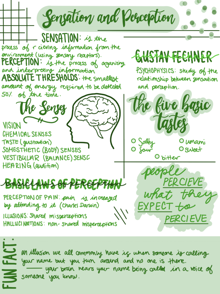
To achieve inclusive design, we can explore and experiment with various tools, such as the Web Accessibility Evaluation tool (WAVE) and other tools, such as captions. The WAVE tool Is an evaluation tool to help authors, contact creators, and website designers create a more accessible environment for individuals with disabilities. For example, I used the WAVE tool on my last blog post, and here is some of the feedback: some of the colours were low in contrast, my video did not contain captions, and my sketchnote example would be difficult for someone to read as it includes fancy writing and would not work with text-to-speech tools. There are a host of other tools we can use to create a more inclusive design. For example, we can use captions on videos for those with hearing or processing impairments. Further, in text, we can utilize various fonts and effects, such as bold, italic, or underlined, to draw attention to important information. I love utilizing fonts and effects in my blog posts to draw attention to important information or notable quotes. Images can also be used in an inclusive design, as we can include an alt text describing the picture. I always provide an alt text describing the picture or video for all of the photos and videos I have in my blog posts. Providing an alt text helps those with reading impairments to use text-to-speech tools to ensure they have access to all the information they need to be successful. We must continuously work to recognize exclusion where it exists and work to correct this exclusion, which these tools help us accomplish.
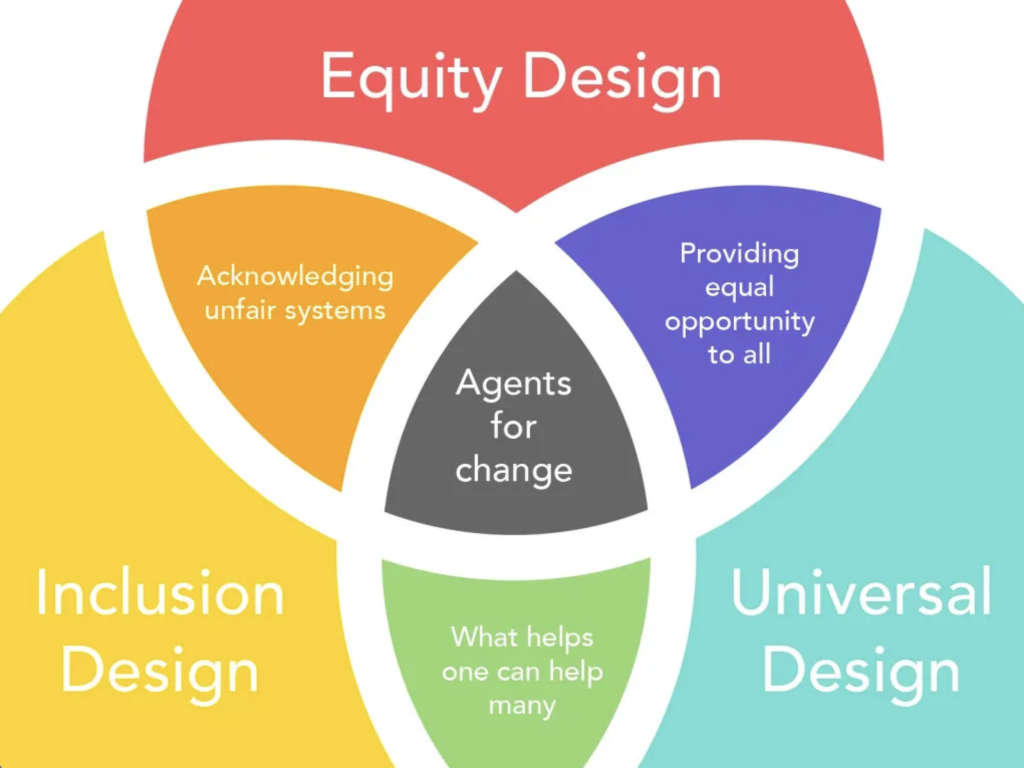
Inclusive design should not be mistaken for universal design. Inclusive design is “a methodology that enables and draws on the full range of human diversity. Most importantly, this means including and learning from people with a range of perspectives” (Vinney, 2021). In comparison, universal design is “the design of products and environments to be useable by all people, to the greatest extent possible, without the need for adaptation or specialized design” (Vinney, 2021).

Creating media and multimedia to suit every individual’s needs is challenging. However, when designed with universal design guidelines, the result is a single solution that can accommodate as many people as possible (Jungles & Patel, 2019). For example, we can work to create an inclusive design for a few learning disabilities, such as those with hearing impairments, and these additions, such as captions, can be extended and helpful to many. Universal designs are curated based on diverse characteristics, such as ability, age, gender, race and ethnicity, to serve as an accessible resource to as many people as possible (Jungles & Patel, 2019). When we try our best to think of our target audience, work to address the needs of our population, and employ ideas and concepts of multimedia learning and UDL, we will be well on our way to creating an inclusive learning environment and design.
I hope you all enjoyed 🙂
Amelia
References
Jungles, A., & Patel, C. (2019, June 24). What is universal design for learning?YouTube. Retrieved September 26, 2022, from https://www.youtube.com/watch?v=pdmoBl3Z75I
Mayer, R. E. (Ed.). (2014). Principles for Reducing Extraneous Processing in Multimedia Learning, from The Cambridge Handbook of Multimedia Learning (2nd ed.). Cambridge University Press. pp 279 – 315
Merrill, M. D. (2002). First Principles of Instruction. ETR&D, 50, 3. pp. 43-59.
Vinney, C. (2021, August 5). Universal vs. Inclusive Design: What’s the difference? Career Foundry. Retrieved September 26, 2022, from https://careerfoundry.com/en/blog/ux-design/universal-vs-inclusive-design/


