
Hi everyone!
After checking out the comical World’s Worst PowerPoint Presentations, I found they all had one thing in common: each looked like a party (Purewal, 2010). In other words, there was so much going on it was hard to focus, decipher, and understand all the information—they all looked like a busy intersection. In fact, these presentations lack many design and multimedia principles.
First, each PowerPoint presentation violates the signalling principle, one of Mayer’s 12 Principles of Multimedia (DeBell, 2020). The signalling principle states, “humans learn best when they are shown exactly what to pay attention to on the screen” (DeBell, 2020). If these PowerPoints were to align with this principle, they would ensure that the most important thing on each slide would be the most prominent (Phillips, 2014). Currently, these presentations are so scattered it’s challenging to focus. Further, if the PowerPoints were to align with the signalling principle, they would utilize contrast to guide learners throughout the information on every slide (Phillips, 2014). Currently, as I previously stated, the information on each PowerPoint is extremely jumbled together.
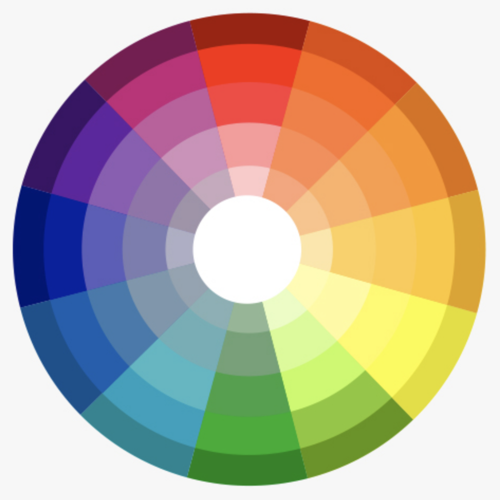
Next, the PowerPoint presentations lack the consideration of inclusive design and universal design learning principles, such as optimizing colour in design (Adobe, 2020). Each PowerPoint colossally fails to consider colour choices. For example, many slides use similar colours, such as yellow and orange, and others use colours, such as red and green, which are susceptible to colour blindness. To improve these PowerPoint designs, the designers would need to select colours that are contrasted. As a frame of reference, a good strategy for colour choice is to look at a colour wheel and choose colours that are opposite to one another.
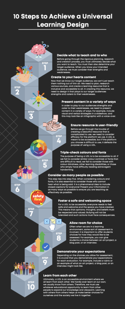
I took the liberty of creating an infographic. While creating this infographic, I considered the signalling principle and optimizing colour. You will see that I chose a layout with numbers that signal the order of items. Further, the colours I chose are highly contrasted, which allows the design to be accessible for all users.
I hope you enjoyed the read 🙂
Amelia
References
Adobe Express. (2020). 8 basic design principles to help you make awesome graphics. Adobe. Retrieved October 5, 2022, from https://www.adobe.com/express/learn/blog/8-basic-design-principles-to-help-you-create-better-graphics
DeBell, A. (2020, July 24). How to use Mayer’s 12 principles of multimedia learning. Water Bear Learning. Retrieved October 5, 2022, from https://waterbearlearning.com/mayers-principles-multimedia-learning/
Phillips, D. (2014, April 14). How to avoid death by powerpoint. YouTube. Retrieved October 5, 2022, from https://www.youtube.com/watch?v=Iwpi1Lm6dFo
Purewal, S. J. (2010, August 17). Top 10 world’s worst powerpoint presentations. PC World. Retrieved October 5, 2022, from https://www.pcworld.idg.com.au/slideshow/366369/world-worst-powerpoint-presentations/
Leave a Reply