Hi everyone! My multimedia project is an interactive learning resource I created for EDCI 335 in the summertime. This interactive learning resource is about stress, and the goal of this resource is to teach children ages 11-14 (middle school-aged) about stress and how to manage it. Essentially, these resources strive to educate middle school-aged students about stress and coping techniques to help increase their overall emotional intelligence and well-being. Throughout the remainder of the blog post, I will list the issues of my original learning resource and how I corrected them in my improved learning resource based on the concepts we have learned throughout this course.
Here is the original slideshow presentation:
Here is the updated and improved slideshow presentation:
Here are the links directly to the Google documents to see the speaker notes:
- Before: https://docs.google.com/presentation/d/15BOZdsNDUOfaF219rKEYi2XM1VTYVWhZLxXhA1oOaNQ/edit?usp=sharing
- After: https://docs.google.com/presentation/d/1PEq3z9qgj3f7Q_OrA_61caM8-BMVdEtTYi4WdyNSy9Y/edit?usp=sharing
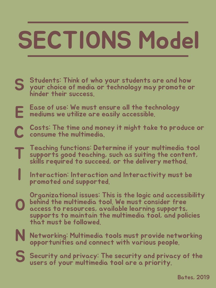
To begin, I used the SECTIONS model to identify the issues in my multimedia learning object. The SECTIONS tool is an analytical approach that involves asking questions about who your students are, the accessibility of the multimedia tool, the costs of creating the tool, whether your tool is a good way to teach your chosen material, whether the tool promotes interaction, the organization to the resource, the networking opportunities within the resources and overall security for the users (Bates, 2019). Using this strategy, I could see my resource from a different perspective, allowing me to see the weaknesses of my resource, such as colour contrast, font, learning outcomes, making full use of the program of choice, and activities.
You will first notice that the colours do not contract well; therefore, it is very hard to see the content on these slides. According to the Universal Design for Learning (UDL) framework, based on Cognitive Load Theory, it is essential to ensure there is enough contrast between the text colour and the background to ensure that those can easily view and access the information (CAST, 2018; Hendricks, 2016). Using colours high in contrast and that are not red and green ensures that the resource is accessible to those with colour blindness. Further, according to Cognitive Load Theory, using colours high in contrast will help learners focus on the key information without overloading their senses (Hendricks, 2016). In my updated learning resource, I have chosen high-contrast colours that are not susceptible to colour blindness; thus, the slides are easy for everyone to read and focus on.
Also, various fonts, such as all capital fonts on slides 4 to 6, make it hard to focus on the critical information on the slide. According to the Signalling and Coherence principles, it is essential to ensure that the most important thing on our slide is the most prominent and to use contrast to move the audience around the information on the slide (Mayer, 2014). Therefore, in the improved version of my learning resource, I have changed the fonts and rearranged the spacing between some of the elements on various slides, mainly slides 4 to 6.
Diving into the slideshow’s content, the presenter jumps straight into the topic without any welcome, introduction, or setting out the learning expectations. According to the planning decisions at the core of instructional design, It is important that students know the learning outcomes or objectives so that they can attend to the key information throughout the lesson (Kurt, 2015). In the updated version of my multimedia learning object, I have included an introduction of the topic and the learning outcomes, which are aligned with the assessment activities throughout the overall design. Overall, this adheres to instructional design principles and Mayer’s Coherence principle (all information fits together like pieces of a puzzle; Kurt, 2015; Mayer, 2014).
This slideshow is for the teacher to use to present to the students; however, there are no speaker notes. Speaker notes are helpful tools for the presenter to leave ideas and key points they must bring up in addition to the slides and essential questions that need to be asked. According to the Redundancy principle, it is important that instructors do not read text directly off the slide; instead, the audience should read it (Mayer, 2014). Speaker notes can be utilized to include what you want to say in a different way than what is already on the slide. Therefore, in the improved version of my learning resource, there are speaker notes included on all the slides, where necessary.
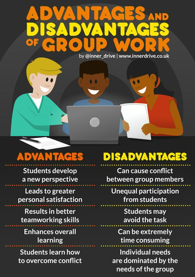
There are various activities in this slideshow; however, some of these activities, such as the class discussion, the essay, or the think, pair, share activity, may not be accessible to all learners.
- The class discussion asked students to share their experiences of stress; however, this may be traumatic or triggering for some students. Mental health is always a complex topic to address in the classroom, as not everyone is always kind. Therefore, in the updated version of my learning resource, I included speaker notes and visual reminders for students to be kind and respectful.
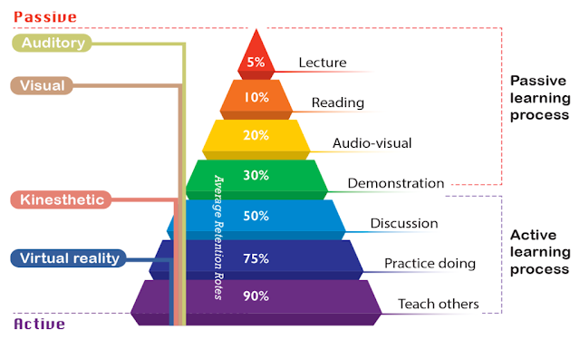
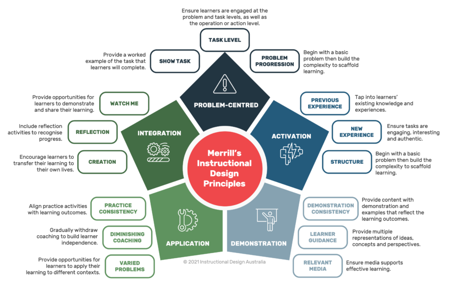
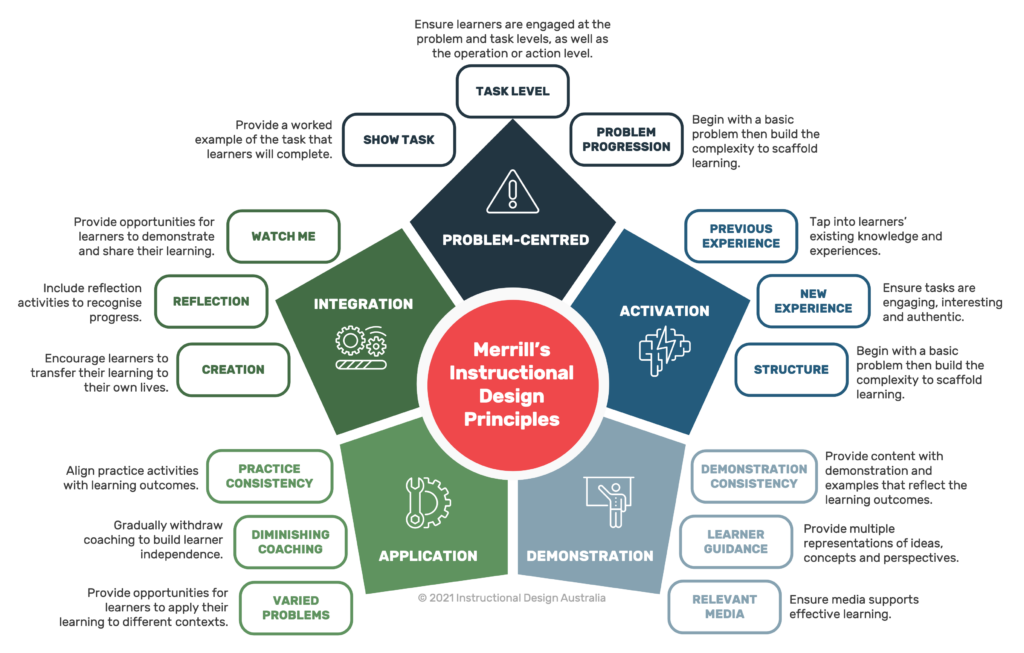
- The activity for module three, to write an essay about eustress and distress, is very prolonged and excessive. It’s best to use smaller, more informal assessment forms to ensure student learning and understanding. In the updated version, you will see I have completely changed this activity to a compare and contrast chart on the differences between eustress and distress. This activity will help increase student engagement and interaction, thus promoting active learning and adhering to Merrill’s principle of Engagement (Mathers, 2017; Merrill, 2002).
- Notes should also be included on how the teacher can work to modify the activity if it is not going as planned. For example, the think, pair, share activity may be challenging to complete this activity. Therefore, in the updated version of my slides, I have included speaker notes on how the teacher could modify the activity.
In addition, in the original resource, there are no other sources of media for students to learn from. According to Mayer’s Multimedia principle, it is essential that students have multiple forms of information to ensure they understand the material (Mayer, 2014). Therefore, I have included multiple brief videos relating to each topic to help enhance student understanding.
Overall, I believe the changes I made to my multimedia learning object would effectively increase knowledge transfer in prospective students based on multimedia learning principles and related learning theories we have learned throughout this course.
Thank you, and I hope you enjoyed it 🙂
Amelia
References
Bates, T. (2019). Teaching in a Digital Age – Models for media selection. https://pressbooks.bccampus.ca/teachinginadigitalagev2/chapter/9-1-models-for-media-selection/
CAST (2018). Universal Design for Learning Guidelines version 2.2. Retrieved from http://udlguidelines.cast.org
Hendricks, D., (2016, April 17). Cognitive load theory, how do I apply it? YouTube. Retrieved November 6, 2022, from https://www.youtube.com/watch?v=stJ-MkTgRFs
Kurt, S. “Instructional Design Models and Theories,” in Educational Technology, December 9, 2015. Retrieved from https://educationaltechnology.net/instructional-design-models-and-theories/Dr. Serhat Kurt, Instructional Design Models and Theories. Sept 28, 2022.
Mathers, B. (2017). Wikipedia – Active vs Passive learning.https://bryanmmathers.com/wikipedia-active-vs-passive-learning/CC-BY-ND (images for Active/Passive Learning interactivity)
Mayer, R. E. (Ed.). (2014). Principles for Reducing Extraneous Processing in Multimedia Learning, from The Cambridge Handbook of Multimedia Learning (2nd ed.). Cambridge University Press. pp 279 – 315
Merrill, M. D. (2002). First Principles of Instruction. ETR&D, 50, 3. pp. 43-59.

